Why your content strategy needs brand infographics

Competing for your audience’s attention has never been harder.
This onslaught of digital content has led to another challenge, dwindling attention spans. Microsoft found that our attention spans have decreased from 12 seconds in 2000 to just 8 seconds more than 20 later.
Another study by The Technical University in Denmark suggests that thanks to the volume of multi-channel content in circulation, this 8-second focus is actually getting even shorter.
To beat the competition and get people’s attention, creating valuable, eye-catching content is an essential element of every company’s content marketing strategy.
Cue branded infographics (also known as branded content infographics, marketing infographics, or company infographics). Humans can process visuals 60,000 times faster in the brain than text, making these highly visual assets a smart strategy for encouraging people to engage with your content.
SUMMARY
Top tips for brand infographics
If you’re looking to increase brand engagement, check out our below guide to brand infographics to find out why this type of content is such an effective marketing tool and learn some top tips for creating high-quality corporate infographics.
Why are infographics so effective?
Whether you’re looking to simplify a complex process, showcase your latest research or raise brand awareness, here are a few reasons why brand infographics are one of the most popular forms of content used by today’s marketers.
They make information more accessible
One of the best things about branded content infographics is that they force their creators to condense their information, making it more user-friendly.
Instead of having to read a 30-page report or shift through a series of complicated graphs, readers can scan your one design asset and quickly access your marketing messaging and research findings.

The same applies to creating assets for complex processes or topics. To translate valuable information into a marketing infographic, you have to simplify your content, resulting in a visualized process that helps make your data easier to understand.
They make your content more memorable
Not only do brand infographics make your content more accessible, but data visualization tools have been found to boost memory recall.
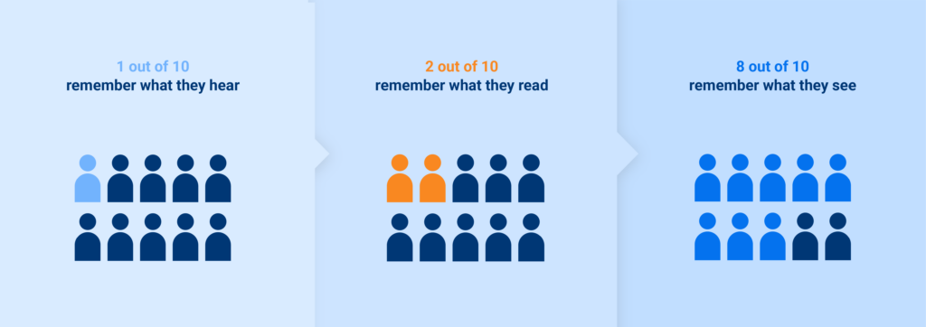
According to Wyzowl, only 10% of people remember what they hear, and 20% remember what they read. Comparatively, 80% remember what they see.
Supporting these findings, Dr. John J. Medina, an author and leading expert in developmental molecular biology, found that when people hear information, they only remember 10% of that information three days later. However, when paired with a relevant image, people retain 65% of the same information in a three-day period.
Translating your information into visual content such as company infographics effectively taps into the power of visual memory, helping you stay in the minds of your audience for as long as possible. Memorable infographics not only help to convey valuable information, but they also elicit long-term connections with your target audience.

They help increase traffic, SEO, and social media management
Brand infographics play into another major benefit of visual assets, they’re incredibly engaging. Primed to go viral, these highly engaging assets increase your chance of getting clicks and shares that will drive traffic to your site.
For instance, Hubspot revealed that blog articles that included brand infographic examples generate an average of 178% more inbound links and 72% more viewsthan all other posts.
Being both valuable and visual, this also positions your infographic for optimum social media engagement on social media marketing platforms like LinkedIn, Facebook, Instagram, etc. People are much more likely to share a beautifully designed asset that contains a load of useful insights rather than a text-heavy social media post.
When high-quality graphic design and data visualizations are paired with the right keywords and phrases, this increase in traffic and engagement ultimately helps boost SEO, sending your content further up Google’s search rankings. The best in the digital marketing industry use infographics to set their company apart from competitors online and solidify brand identity.
They increase brand awareness
With visuals being an integral part of your infographic, branding your infographic with elements of your brand world such as a logo, color palette, and icons is a clever way of aligning your findings with your business to raise brand visibility.
5 Top tips for creating and branding infographics
Packed full of accessible, memorable, and shareable information, brand infographics rely on exceptional design aesthetic, structure, and elements to position them for viral success.
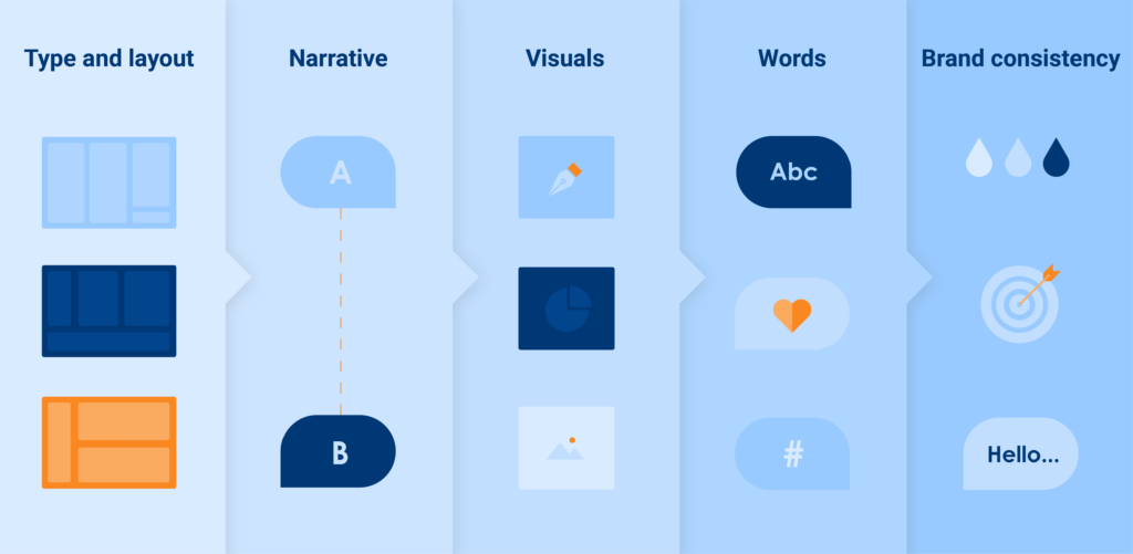
Below are five factors to consider when creating your own visually optimized, standout infographics and infographic templates.
1. Infographic type and layout
After you’ve collated all your key data and insights, the first thing you need to decide is what type of marketing infographic will best showcase your information.
There is a range of infographics, including statistical infographics, informational infographics, timeline infographics, and comparison infographics. Think carefully about which layout will bring your information to life in the most visually appealing way and will also work with the design elements you’re using to present your data (e.g., graphs, flow charts, timelines, icons, lists).
Pinterest is an excellent source of inspiration for different branded content infographic types if you’re struggling to visualize how your data could look. Additionally, you should ensure that your color schemes, fonts, and other visual elements align with your company’s brand.
2. Content narrative
Most people are visual learners. The human brain not only processes visuals more easily than text, but it also is more engaged by storytelling.
Ensure your company infographic isn’t just visually pleasing but also connects different pieces of information to tell your audience a story.
A reader should be able to navigate through the various sections of your design seamlessly, so try to create a narrative flow by deciding on a strong angle for your infographic.
As tempting as it may be to include all your hard-earned or interesting statistics, if any appear random or don’t serve to add to the story you’re telling, be ruthless and remove them from your piece.

3. Visuals
Key to your infographic’s storytelling abilities will be the graphics you choose to include in your design. Whether you go for photography, icons, charts or illustrations, you need to find a visual language that communicates the story you’re trying to tell.
Turning visual elements into storytelling components also enables you to cut down on your word count. The best corporate infographics balance words and visuals, and too many words will take away from your work’s impact.
Although a major vehicle for brand strategy, infographics shouldn’t be crammed with too many of your company’s design elements. Leave enough white space to let your design elements breathe, preventing the reader from feeling overwhelmed.
4. Words
As we’ve just mentioned, keep your copy to a minimum and include keywords to help SEO rankings. You should also consider adding strong calls to action such as to ‘click for more information’ or ‘share on Twitter’ to increase engagement.
Remember to write an enticing title to encourage people to read your brand infographic. Coschedule’s Headline Analyzer is a great tool for evaluating how compelling your proposed headline is and giving you tips for how to improve it.
For typography, make sure to create a simple ‘text hierarchy’ consisting of a header, subheader, and body text (with easy-to-digest text and spacing). Organizing your text in this way will add to its legibility, user experience, and visual appeal.
5. Brand consistency
It’s important to remember that your company infographic is an extension of your branding. Rather than simply adding a large logo to your design, make sure every part of your infographic, from the color schemes you choose to the words you use, is consistent with your company’s brand guidelines.
Particularly if all goes well and your brand infographic achieves high reach and engagement, you want the design to be a true reflection of your brand world and identity. You also want the content to seamlessly connect to other branded assets such as your website, giving users a consistent user experience f your brand.


