UX/UI insights on Hive and the evolution of the digital workplace
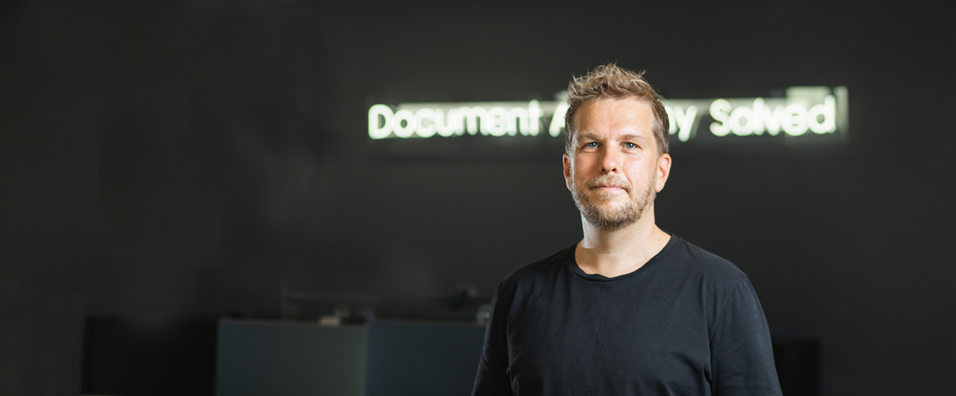
Following Templafy’s recent Hive platform launch, we spoke with Caleb Wilson, Head of Product Design, to get his thoughts on modern design philosophy and what’s trending in the UX/UI world, particularly in light of 2020 – the year that accelerated global engagement with the digital workplace.
Caleb is one of the minds behind the new user interface and user experience that has completely transformed Templafy’s Admin Center in the new Hive platform.
How is the digital workplace evolving from a UX perspective?
“The most obvious change– particularly during 2020 – is the increasing number of platforms people are using and needing to learn to navigate. A product’s offering can hold great value, but an illogical, disconnected or outlandish user experience can hide that fact.
UX design has always intended to reduce cognitive load in a product, but I think we are moving beyond that, towards reducing friction in a workflow that involves multiple products and multiple participants. This is a complex challenge that we at Templafy are tackling head-on.
To do this, we increasingly gather insights into the user journeys on our platform, but also other platforms used in diverse workflows. We follow best practices and industry-standard patterns to ensure a sense of seamlessness, familiarity and connectivity in the product. Fundamentally, we are focused on making the value of the product shine – by great design.”
Increasing reliance on digital interfaces has intensified the scrutiny around UX. Is this trend accelerating UX updates and informing UI design?
“Isolation and work-from-home rules mean you have nobody beside you to assist you if you can’t get a product to work as intended. While UX has always been about making things easy to use, the effect of this work is becoming increasingly apparent.
In a broader context, there’s been an interesting shift over the past few decades. We went from the cubicle setup and closed offices when we used maybe two products. And then it became open office spaces, we’ve got hundreds of products, and everyone’s contributing.
Now, suddenly, we’re all alone again in our home-offices with hundreds of products. You’ve got apps on your phone, you’ve got programs on your computer, cloud products, products that utilise other products, and lots of integrations. I think that good product designers are increasingly recognising this and designing products that decrease complexity and solve problems in these situations.”
How do organizations prioritize empathy in their design thinking when it comes to employee experience, and how this has become more important in 2020?
“With meetings held via video in our own homes, we’re getting glimpses of the person’s real-life beyond the employee. We’ve seen the inside of homes, everyone’s kids and cats; we’ve seen people in stressed mode and personal identifiers that you just don’t get to see in an office environment, and this is a very real driver of empathy.
I’m sure this means that people have now really come to understand how the person working with the product has “a life” and has their own set of thoughts, biases, preferences, etc. And when bringing new products into an enterprise, you have to think about those things. It can’t just be feature-based, it has to “help the people who are doing the work”, and I think that’s where things are moving.”
What’s the philosophy behind enterprise usability and the thinking behind the new trends in this area?
“When it comes to enterprise usability; remember that an enterprise product’s start point is often with one person or a small group of people. Often, enterprises adopt a product because of its features and functionality. Next, they implement it, and then they have the task of making sure the end-users in the organisation adopt the product.
User adoption is a huge task. Particularly for one person in a large organisation. The whole idea of having an offering in a product that makes sense to the end-user (and not just the organisation) has become very apparent, and it’s something that needs to be worked on to a very high degree.
User adoption doesn’t happen because the product is good, or the feature is great. It happens because of how it’s been presented, explained, onboarded, and presented in the UI.
The end-users’ first meeting with the feature or product is the make-or-break point. It’s crucial to think through the whole customer journey from where they’ve heard about this product until it becomes something they use every day. And that’s where UX and design can come in, and that’s a focus we have on our product currently.
Some trends are happening that are important to tune into. Take accessibility, for example. We want accessibility to move from being a trendy topic to a fundamental part of the design process. I’m certain that pretty soon, accessibility will be enforced by national laws.
The more we move online, the bigger the pool of people with different capabilities – whether it’s colour blindness, reading disability or something else – who also need to use a product.
Right now, we are retroactively checking our product for improvement areas, and moving forward, we will be proactively conscious about accessibility standards.”
What prompted Templafy to update the UI in Hive?
“We needed to update our UI because Templafy’s functionality has been growing so much over the years. And with that complexity comes inconsistencies, and with inconsistencies come design issues.
I think a lot of products that have experienced growth like Templafy have run into similar issues. That’s why we see huge redesigns of products where suddenly there’s a whole new structure.
We wanted to take the first steps to make sure that we have a flexible product. With Hive, it became more flexible on the technical side, and we needed it to be more flexible on the design and UX side too. We initiated a process where we did an overhaul of some of the main features, the main screens and made sure that we were thinking ahead while designing for “now”.”
What changed with Hive, and how are the changes aligning with trends in UX?
“When Templafy started out, employee usage was primarily through the add-in. One of our offerings is the whole idea of working together with different platforms and facilitating business processes.
Over time we saw increasing interest in application integrations from enterprises, and that gave us good reason to focus on the cross-platform readiness of Templafy. We were no longer simply improving existing workflows. We were making users more productive by giving them a better-quality workflow – something we are still focused very much on enhancing.
All in all, we simply can’t have a product that has different ways of doing the same thing. It gets confusing. We must create consistency in the product, particularly as we’re growing rapidly and adding more functionality and features, and that’s a lot of what Hive delivers.”
How will the changes affect enterprise users?
“Right now, the product changes we’re talking about are on the admin side. But the admins are the people who control most of what the end-users see – and the end-users are a large number of people.
Most products are nothing without the content that’s in them, and that certainly applies in Templafy. We don’t have any content. It’s all our customer’s content. So, it’s about giving the admins better flexibility and better trust in Templafy and themselves to do some things that will pay out to the end-users using their product.”
What are the key differences Templafy’s new platform will have for users?
“I think consistency is something we’ve been working on so that in terms of navigation, we don’t have conflicting ways of finding what you are looking for.
We’ve also worked on creating a design system that lets Templafy be a product that has its own brand presence but can easily contain another company’s brand without conflicting or fighting each other. We’ll use our brand assets, but use them in a way that can coexist with our customer’s brand.
It’s easier to read with the new fonts and font weights. We changed our UI font to Roboto, which is the most used Google font right now, because of its great screen legibility. That was a very conscious decision because we want to create a very sleek reading experience and easy overview, and we don’t need a font that gives a whole lot of identity. We need a font that enhances productivity.
And finally, I think we have created a better overview with a better hierarchy of tasks and content, clearer calls-to-action, and overall a better structure to enhance usability and workflow.”
