The elements of a successful company logo design in 2018

Uber is no stranger to making headlines, and in September this year, the industry disruptor experienced a new source of controversy – its logo.
Designed by Wolff Olins, the new logo deeply divided critics. Some found its simplicity and switch to the new bespoke font ‘Uber Move’ a friendlier design which reflected the app’s global, modern positioning. Others voiced criticisms ranging from underwhelming to a total design catastrophe.
At the heart of Uber’s new brand asset was this all-important question – what makes a good company logo design? Whether a symbol, wordmark, or mix of the two, a logo serves as the most obvious of the graphic elements of brand identity. As the face of your brand, it should instantly identify your company. For example, the best company logos such as Twitter’s bluebird, Apple’s bitten apple, and Nike’s swoosh all immediately conjure up a brand’s values, story and messaging.
We take a look at a few examples of brands who introduced new logos in 2018, to explore what successful company logo elements look like and the subsequent lessons to be learned for those embarking on a new logo.
Burberry: securing buy-in for the new company logo design
In August 2018, luxe fashion house Burberry took to Instagram to reveal their new company logo design. Commissioned by Burberry’s new chief creative officer Riccardo Tisci, and designed by Peter Saville (who has a recent Calvin Klein rebrand to his name), the logo was a huge departure from its established horse and knight emblem. Replacing the iconic graphic was a much simpler design – the words ‘BURBERRY LONDON, ENGLAND’ in a bold, modern and minimalist font.
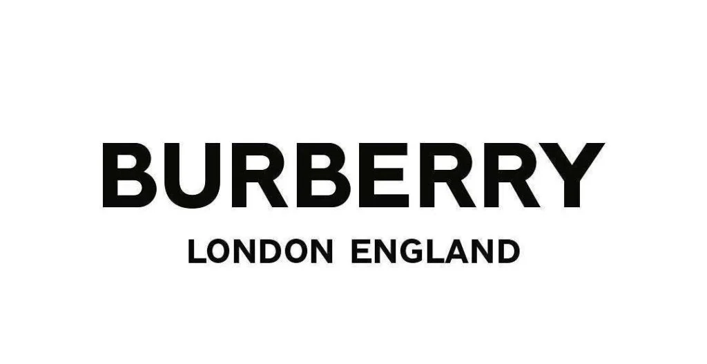
Image source: Burberry Instagram
Part of the logo launch strategy included posting screenshots of email communication between Tisci and Saville, also on Instagram. The posts detailed Tisci’s request to have a completed logo design within four weeks, and Saville responding: “You must be crazy. You need four months for a project like this!” Emails also shared the designers’ inspiration for the logo redesign with audiences, citing Tisci’s hunt through archive material and an original Burberry logo commissioned in 1908.
As with any company logo update or the refresh of an iconic brand, there was some consumer backlash. However, critics widely celebrated how the logo moved Burberry into digital realms. The logo also represented the enterprise’s new much-needed change of direction under Tisci following the departure of much-loved designer Christopher Bailey and the company’s £28.6 million stock burning scandal. Despite initial disagreement on project turnaround, when they revealed the final project, Tisci and Saville expressed their mutual feelings of excitement and joy around its ‘genius.’
Company logo design takeaways:
Although Burberry didn’t win absolutely everyone over with its minimalist new company logo graphic design, overall the company succeeded in many aspects of successful company logo design and implementation.
Firstly, its design matched its intention. The radically different design clearly showed Burberry was serious about change – from its new creative direction to stance on sustainability. The Instagram reveal served not only to show Burberry was moving forward into the digital age, but told followers the story behind the logo in a very transparent way. These behind-the-scenes conversations between Tisci and Saville clearly communicated the next chapter in Burberry’s future, helping bring clients and internal teams on the rebrand journey to secure buy-in.
This design process between Tisci and Saville is another lesson in company logo design. Tisci’s revision of his original deadlines gave Saville the resources he needed to make the logo design happen. Communicating through the challenges, expectations, and realities of company logo design ensures that the team has the tools they need to move the brand forward successfully.
Ogilvy: giving a company logo meaning
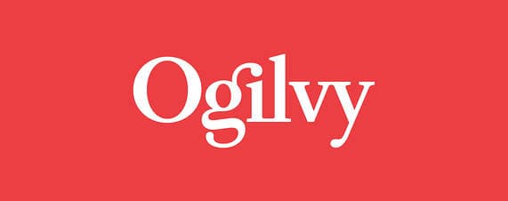
Image source: WSJ
Choosing the Wall Street Journal over social media, on June 5th, 2018 ad agency Ogilvy announced their first rebrand in 70 years, alongside company logo design service and consultancy Collins.
Following decades of the evolution, Ogilvy’s copywriting and product branding roots had diversified its offering to increasingly data-driven and digital services. To match its recent structural reorganization and collation of numerous sub-brands under one umbrella brand – Ogilvy turned to the power of adopting a new look.
Speaking to The Wall Street Journal, Ogilvy’s Chief Executive John Seifert stated: “We needed to greatly simplify the organization around what I call an integrated enterprise agenda, not a holding company of all these different piece-parts.”
Fronting this fresh new look, which included a new color scheme, website, organizational design, and brand film, was the proud new company logo design. Most obviously, the logo powerfully reflected its organization’s unified structure by losing 70-year old “& Mather” part of its name to move forward as a single word. The logo also introduced a brighter Pantone red, as well as a bolder typeface. The wordmark, detailed by Collins:
“…transitioned from David Ogilvy’s signature — the mark of one person — to a redrawn version of the existing corporate typeface, Baskerville — thus becoming the mark of many people.”
This notion of moving from one to many people tied into Ogivly’s internal culture push which encouraged employees to feel creative ownership of the brand.
Company logo design takeaways:
Ogilvy’s new company logo design is the perfect example of smart design. Every aspect of the logo works hard to represent and implement the ad agency’s new strategic position.
- The change of Pantone helped the brand stand out in an increasingly competitive market.
- Dropping the “& Mather” conveyed a unified force rather than divided factions.
- The typeface transition from Ogilvy’s signature to a font used by Ogilvy employees every day, aligned with the internal culture objectives to make individuals feel they had as much right to the brand as Ogilvy himself.
- Cleverly, by writing employees into the new Ogilvy story and giving them a sense of ownership, the brand recognized the power of making employees brand ambassadors.
As daily communicators of brand identity, employees need to be on-board with even the smallest tweak to a company’s visual language. Successful implementation of company logo branding considers how to encourage every member of its organization to remain on-brand, including the use of your logo on any document from a sales pitch to a contract.
The Guardian: the issue of consistent company logo design
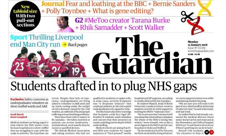
Image source: Marketing Week
At the start of the year, British newspaper The Guardian had a major brand overhaul as a response to declining sales and an increasingly turbulent print news industry. Led by The Guardian’s in-house team and in collaboration with Commercial Type, a new logo spearheaded a move from the “Berliner” size to tabloid dimensions, as well as a new website and font.
The Guardian’s lowercase blue and white typeface, first launched in 2005, was reworked into much bolder black lettering that was noticeably sharper and taller. Guardian’s editor-in-chief Katharine Viner said of the company logo update: “The masthead has a renewed strength and confidence to represent the Guardian’s place and mission in these challenging times.”
A variation of the logo also appeared using the new logo’s new uppercase “G.” Arguably one of the most well-designed responsive logo design examples of 2018, the image sat neatly in a circle, looking great on social media channels and the newspaper’s app. Digitally optimized, the new company logo design was set for the digital age. Comparatively, the Guardian’s old logo even though it too was a responsive logo design, looked awkward and outdated.
Company logo design takeaways:
Brands have to keep evolving to remain relevant. Everyone from Facebook to YouTube, Nike to McDonald’s have updated their logo regularly to keep up with the ever-changing nature of fast-moving markets and communication channels. The Guardian’s new logo works really well in asserting authority and confidence in a troubled industry where newspapers are dwindling in numbers and being discontinued. Its digital nature sends a message that the newspaper can keep up with the obstacle of overcoming a shift from physical to digital print readership.
Despite all the great work done by the company logo design team, there is a word of warning attached to The Guardian’s rebrand. The Guardian took great care and consideration in ensuring consistency across print and digital platforms – with commentators particularly impressed with how the logo worked well in terms of editorial design. Regarding its roll-out, however, many were left confused when the Guardian published their new logo in print while leaving their app behind in the old brand world under the old logo. Speaking of the roll-out Lewis Jones, managing director of design firm CBA commented:
Producing a hard-working, great looking and digitally optimized logo is one thing. Making sure it’s rolled-out effectively is another. You need to strategize the different stages of your rebrand both internally and to the outside world. This means considering how you rebrand everything – from email signatures to office signage, business pitches to marketing campaign assets. The strength of your brand is dependent on consistency, and all risks to brand equity need to be considered thoroughly.
How can Templafy help ensure successful company logo design?
Consistency stretches beyond initial design processes to implementation. Any tools that help busy employees effectively communicate a new brand world will help provide a consistent customer experience and avoid issues of brand compliance. Here are some of the main ways that Templafy can assist with launching and maintaining your new logo design:
- Monitoring your brand world: Templafy allows employees to easily validate documents and emails by identifying any off-brand content such as old fonts, company colors, and logos. The plug-in then offers on-brand alternatives at the click of a button.
- Providing easy-to-locate, compliant assets: Templafy’s Library acts as a central hub for all best practice templates, brand elements, and digital assets. Brand Managers now have the necessary tools to assure employees have access to document templates complete with new logos in the correct place.
- Making employees brand ambassadors: Templafy gives employees the tools they need to keep branding consistent. Hosted via the cloud, Templafy can seamlessly integrate with Digital Asset Management software, CRMs, and central databases to allow employees to access and edit on-brand, pre-populated documents from any device.
- Implementing change immediately: Using Templafy’s centralized Admin Center, Brand Managers can upload new templates and digital assets whenever they need to. Any necessary changes can be instantly rolled out, from a new logo to company address, throughout the entire enterprise.
