6 things the best sales presentations have in common

Crafting a killer presentation is a skill that can make or break a business.
Imagine Eduardo Saverin had tanked his 2004 pitch for “thefacebook.com” or the Uber team had bored their audience to tears with the startup’s 2008 investment presentation? The world we live in (as well as Zuckerberg’s bank balance) would look very different.
Creators of the best sales presentations around, are acutely aware of the value of every single one of their slides. Take YouTube’s original pitch deck. Estimated to have secured $3,500,000 in investment and standing at 15 slides long, each of those slides brings in a cool $233,333 (although worth considerably more when you think of the role they played in Google’s $1.5 billion acquisition of the company in 2006 and its current estimated value of over $100 billion).
With presentations such as creative powerpoint documents being fundamental for sales teams to successfully communicate their products, services, partnerships and collaborations, we’ve reviewed some of the best sales presentations examples we’ve come across and collated six top tips for your next pitch.
1. Lead with problems
According to one of the world’s best speakers and 2014 Toastmaster International Champion, Dananjaya Hettiarachchi, you only have 45 seconds to get your audience’s attention – and keep them listening. If the introduction of your corporate presentation is too long, complex, rambling and, as noted by investor Dina Routhier, self-championing, chances are you’re setting yourself up to fail:
“The most common thing that pegs an entrepreneur as an amateur is when they come in and immediately start talking about their amazing new technology, and forget to start the discussion with, “What big problem in the market am I trying to solve?” If they don’t start with the problem, then I know they are green.”
Business analytics service company Mixpanel provide an excellent case study for how the industry’s best sales presentations deliver Routhiers’ insight.
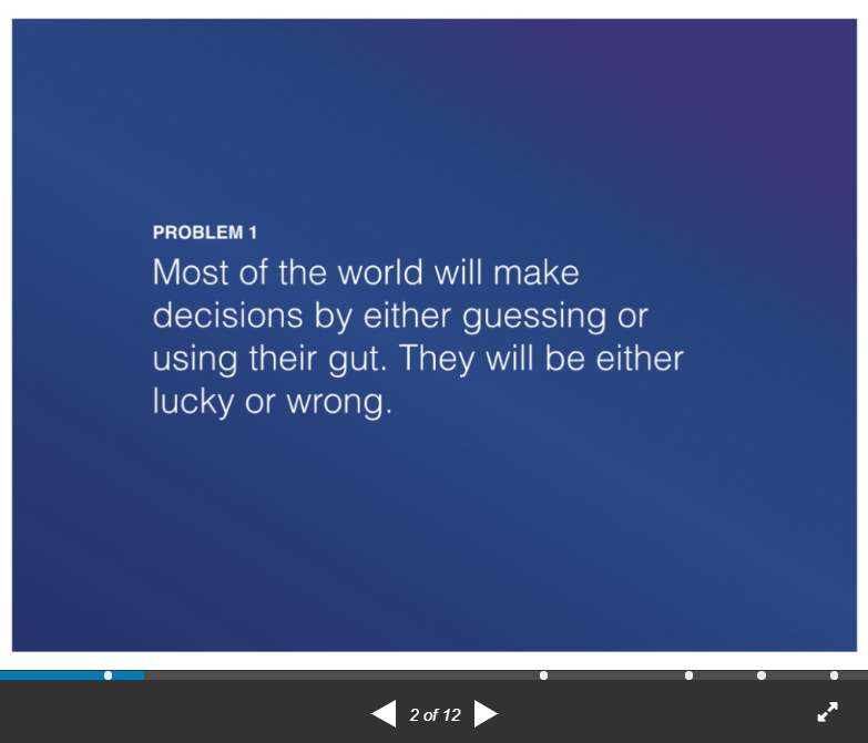
Image source: Mixpanel
Rather than diving into how great their software is or the history of revenue milestones, the presentation starts with two hard-hitting problems facing the market. This then sets the company up to seamlessly discuss solutions to these problems and how their unique offering is the answer the industry has been looking for.
Captivating their audience from the start, Mixpanel’s product was of instant relevance and value to investors. The pitch led to $865M valuation for the company, with CEOs placing so much value on the 2009 presentation that they open-sourced the pitch deck to ‘pay it forward’ to other tech startups.
Read next: 7 essential tips for mastering PowerPoint as a consultant
2. Talk benefits not features
Another tip for creating and delivering your best sales presentation is to focus on your solution’s benefits over its features. As interesting as a product’s solutions may be to your own team, its benefits will be of significantly more interest to external parties.
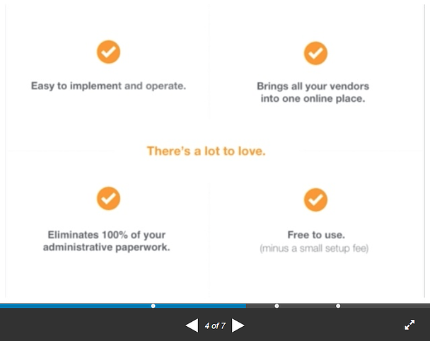
Image source: Mixpanel
Zenefits – the online HCM software for HR, does exactly this in the ‘There’s a lot to love’ section of their seven-slide sales presentation. Forgoing an exploration into its platforms and tech infrastructure, the enterprise outlines its four major benefits, covering implementation, cost and results.
Benefits – whether emotional or financial, will speak directly to the audience, answering key questions such as “Why do I need this?”, “How will this make my company more profitable?” or “Will it make our business more competitive?”.
3. Provide insights
With buyers increasingly clued up on their own shortcomings, alongside talking benefits another strategy that features in the best sales presentations is “insight-selling”. This sees businesses using exclusive insights to demonstrate a deeper level of industry and customer understanding and in the B2B sector it’s key. A study released by Forbes found that 94% of B2B decision makers look for sales teams that can offer specific insights into their organization’s problems.
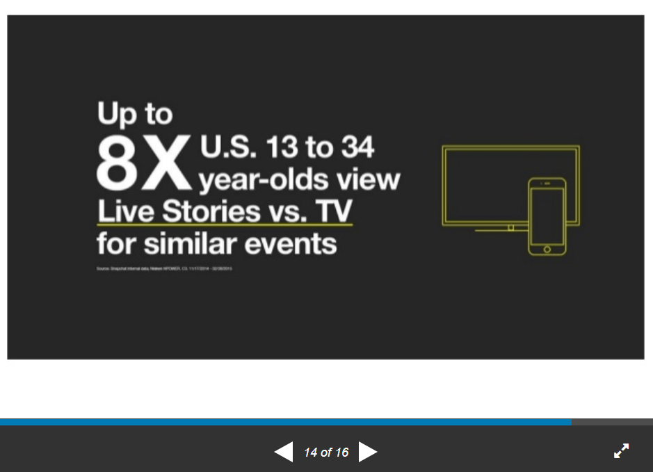
Image source: Snapchat
With over 300 million active monthly users, Snapchat has gathered an enormous amount of data and insights since its 2011 launch and puts it to good use in its corporate presentations, such as its advertising decks. In pulling out platform and audience demographics, the creative powerpoint cleverly positions itself as the place to reach younger audiences via social media.
The (beautiful) presentation also pairs its insights with visual elements. Numbers are emphasized with the use of larger fonts or accompanied by icons and eye-catching imagery. When humans process visuals 60,000 times faster than text, the Snapchat deck is the perfect demonstration of why design is so integral to the world’s best sales presentations.
4. Tell a story
While statistics and insights are extremely valuable to sales pitches, the best sales presentations also add an element of storytelling to the mix.
Research conducted at Stanford’s Graduate School of Business found that while 63% of people recalled a story from a presentation, only 5% recalled a statistic. Speaking of the study, research lead Jennifer Aaker said: “Research shows our brains are not hard-wired to understand logic or retain facts for very long. Our brains are wired to understand and retain stories. A story is a journey that moves the listener, and when the listener goes on that journey they feel different and the result is persuasion and sometimes action.”
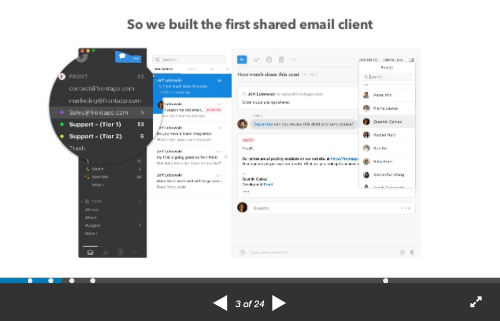
Image source: Front
Front’s investor pitch deck has a unique approach to storytelling, using each slide to simultaneously tell the company’s story while taking the viewer through all vital elements of a sales presentation – from the industry problems it addresses to solutions, case studies to insights.
The narrative approach gives the software company’s presentation a personable touch, natural flow and easy to follow structure. Combined with Front’s clear positioning and slick visuals, it’s easy to see how the presentation raised $10 million in VC funding.
5. Keep it concise
Your audience will be made up of busy people, so keeping sales presentations concise, relevant and streamlined is a must. For instance, sales community and training site Sales Hacker reported that one of the biggest mistakes a sales rep could make is talking about their company too much. Their research found that when sales reps droned on about the likes of company overviews, awards, history and team for more than two minutes, their chances of progressing to the next opportunity milestone and winning the deal decreased.
As the fourth most valuable privately owned startup in the U.S, it’s no surprise that when reviewing the best sales presentations, Airbnb’s pitch deck is one of the most infamous examples of this deal-breaking characteristic.
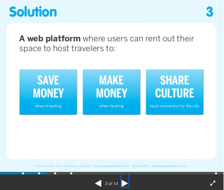
Image source: AirBnB
In just 14 slides, Airbnb’s 2008 presentation covers a lot of ground, with each slide working hard to grab the audience’s attention and build a narrative for the company’s value and proposition. Despite being jam packed with information, the presentation is still minimalist in its appearance, avoiding information crammed slides (another massive faux pas).
6. Be on-brand and consistent
What all best sales presentations examples demonstrate is a consistent look and feel – from their opening intros straight through to the final slide. Though no two slides look exactly the same, the use of on-brand fonts, color palettes and imagery style give these pitches a coherent and professional feel.
Many companies achieve their best sales presentations in powerpoint through best practice templates which they then build on. However, compliance issues can occur when giving employees free reign on design elements – whether that’s bad effects, the wrong typeface or off-brand imagery.
We recently worked with Novicell on this issue, helping the IT consultancy firm create enterprise-wide and future-proof brand-compliant presentations.
Before implementing Templafy, Novicell staff were using a host of different platforms to save and share document templates. As Novicell’s Digital Product Manager, Tobias Lybech Bojesen, recalls, “We pulled presentations from different sources and it was impossible to consistently maintain these assets with the same design and updated content.”
With Templafy’s cloud-hosted solutions, Novicell’s on-brand icons, models, images, logos, and pre-made slides are now all available within PowerPoint so that Novicell’s employees can easily create brand-compliant presentations. As their branding evolves and sales teams get feedback on their pitches, Novicell is able to be more agile when updating content. Novicell employees can easily edit their documents to optimize sales presentations with their latest learnings and company guidelines.
Speaking of the benefits of using automated content creation and brand compliance software, Bojesen says: “Using Templafy to share the great set of templates our design team has created has improved the aesthetics and quality of our sales presentations, and possibly even the performance of our sales team. We spend less time preparing for each meeting because the presentations are ready to be assembled, which means we can focus more on the individual customer’s needs and opportunities.”

