Best practices, design tips, and tools for high-impact email signatures
Ever glance at an email signature before reading the actual content of the message?
You’re not alone. Email signatures serve as a stamp of credibility—a quick way to judge who the email is from, what it’s about, and whether it’s worth your time (sorry, not sorry).
But a strong e-signature is more than just a name, a scribble, and a few links. It’s prime real estate for building trust and driving action. With the right approach, every e-signature becomes a brand touchpoint that reinforces your identity, generates leads, and ensures compliance.
In this article, we’ll explore what to include in your email signatures, the best tools for the job, and how to implement them company-wide.
What to include in your e-signature
We’ve broken down the essentials into three key areas: contact details, marketing opportunities, and compliance essentials.
Step 1: Contact details
Think of this as your digital business card. It should instantly communicate who you are, what you do, and how to reach you.
Key contact details to include:
- Name: First and last.
- Job title and department: Clarifies your role.
- Company logo or name: Reinforces brand identity.
- Location: If relevant.
- Pronouns: Promotes inclusivity.
- Professional headshot: Optional but builds trust.
- Phone number: Direct line for immediate contact.
- Social media links: Professional profiles like LinkedIn.
- Call to action (CTA): “Book a demo” or “Schedule a call.”
Pro tip: Skip unnecessary details like your email address (they already have it) or a fax number (unless you actually use one, but we don’t believe you).
Step 2: Brand and marketing opportunities
The average office worker sends 40 emails daily and receives 121 (The Guardian)—that’s thousands of opportunities each month to promote your latest campaign and generate new leads. And it works: personalized signatures boost click-through rates by 14% and conversion rates by 10% (Webfx).
Despite this, e-signatures remain a largely untapped marketing channel, with only 18.8% of professionals using them for lead generation (WiseStamp).
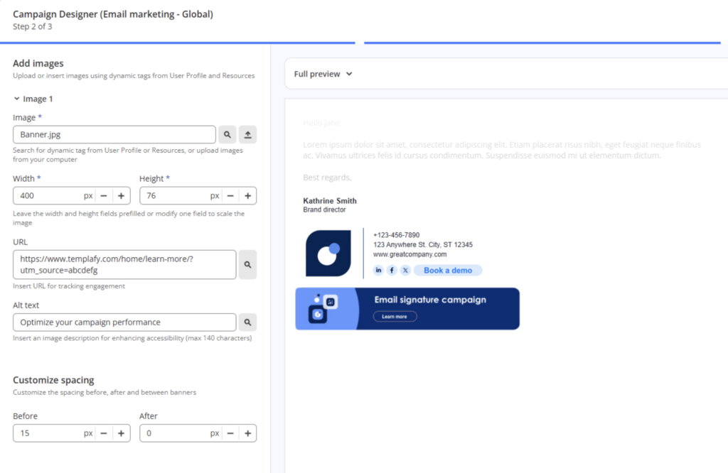
Ways to maximize your e-signature:
- Promote campaigns: Running a webinar or launching a new product? Use a clickable CTA like “Join our next webinar” or “See what’s new.”
- Strengthen brand consistency: Standardize logos, fonts, colors, and taglines to ensure every email looks professional and on-brand.
- Share thought leadership: Link to a blog, report, or whitepaper that showcases your expertise.
- Highlight events: Use a branded event banner or link to increase visibility and engagement.
- Showcase your product: A tagline like “See how [Company Name] helps teams work smarter” keeps your value proposition clear.
- Leverage social proof: Mention awards, media features, or testimonials to build trust.
- Track performance: Add UTM tracking to signature links to measure engagement and optimize accordingly.
Pro tip: Keep marketing elements subtle, relevant, and updated. An outdated promo or off-brand element can do more harm than good.
Step 3: Compliance essentials
Depending on your industry, your email signature might need to meet legal and regulatory requirements.
Some industries, like finance, law, and healthcare, require specific disclaimers or confidentiality notices to protect sensitive information. Even if it’s not mandatory, a short compliance statement can add credibility and clarity.
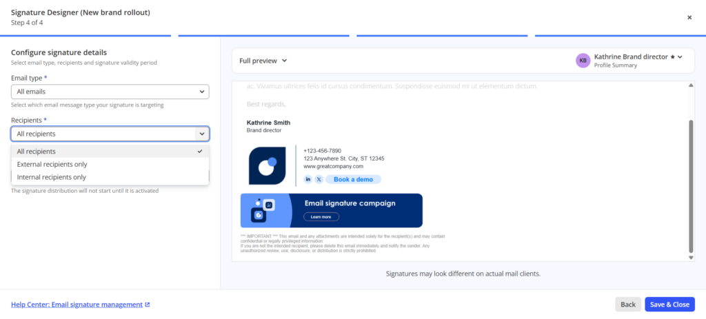
Consider including:
- Confidentiality disclaimers: Useful for legal, financial, and healthcare firms. Example: “This email and any attachments may contain confidential information. If you’re not the intended recipient, please notify the sender and delete this email immediately.”
- Regulatory compliance: If your industry requires disclosures (e.g., GDPR, HIPAA), add a short compliance note with a link to your full policy. Example: “We comply with GDPR regulations. View our privacy policy.”
- Company registration details: In some countries, businesses must include legal details in official communications, such as a registered company name and number.
- Terms of use and liability waivers: If your emails include recommendations or advice, a small disclaimer can protect your business. Example: “This email doesn’t constitute legal advice. Please consult a professional for specific guidance.”
Pro tip: Keep legal disclaimers concise—no one reads a 10-line block of fine print. Link to a full policy if needed.
Top 5 email signature tools based on your needs
Choosing the right email signature tool depends on your specific requirements. Whether you’re a freelancer aiming to enhance your branding or an enterprise seeking centralized control, there’s a solution tailored for you.
Here are some top options:
email marketing
5 email signature tools
- Templafy: best for enterprises needing centralized control
- WiseStamp: ideal for small to medium-sized businesses
- HubSpot email signature generator: best free option for individuals
- Newoldstamp: best for marketing-focused businesses
- Gimmio: best for advanced customization
1. Templafy: best for enterprises needing centralized control
For large organizations, Templafy automates and standardizes email signatures company-wide, ensuring every email is professional, consistent, and aligned with brand guidelines—without needing employees to update anything manually.
- Enforce brand consistency: Centrally manage and distribute email signatures across all employees.
- Automate compliance: Standardize disclaimers, legal notices, and regulatory information.
- Personalize at scale: Syncs with Active Directory to dynamically update employee details.
- Integrate marketing campaigns: Add promotional banners and messaging without IT involvement.
2. WiseStamp: ideal for small to medium-sized businesses
WiseStamp offers an easy-to-use platform for SMBs to create professional, branded email signatures.
- Professional templates: Design sleek, on-brand signatures with minimal effort.
- Marketing banners: Promote offers, events, and key messages within emails.
- Team-wide branding: Ensure consistency without requiring IT support.
3. HubSpot email signature generator: best free option for individuals
HubSpot’s free tool is perfect for freelancers and professionals seeking a simple, well-designed email signature without extra features.
- Quick setup: Free, step-by-step design flow.
- Basic customization: Add name, title, social links, and a logo.
- No advanced features: Lacks team-wide controls or automation.
4. Newoldstamp: best for marketing-focused businesses
Newoldstamp turns email signatures into a marketing tool with built-in campaign banners and engagement analytics.
- Marketing banners: Highlight campaigns, promotions, and events.
- Engagement tracking: Gain insights into signature clicks and interactions.
- Centralized control: Manage team-wide consistency with ease.
5. Gimmio: best for advanced customization
Gimmio offers deep customization options for businesses and professionals seeking full control over their email signature design.
- Custom designs: Tailor layouts, fonts, colors, and spacing.
- Bulk creation: Ideal for teams, agencies, and multi-brand organizations.
- User-friendly interface: Drag-and-drop customization without design skills.
Best practices for an optimized e-signature
There are plenty of elements you could include in an email signature, but you can’t (and shouldn’t) have them all. Here are some best practices to follow to make sure your e-signature packs the best punch.
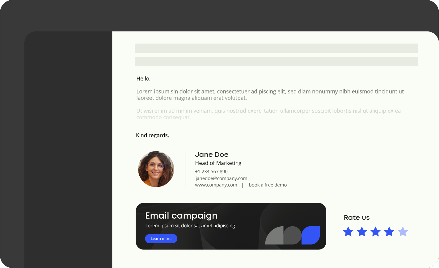
1. Keep it concise
People tend to skim emails, so a lengthy signature can lead to important details being overlooked. Focus on including only the essentials to guide recipients toward the desired action.
2. Optimize image sizes
Large images can slow down email load times, especially on mobile devices, or may not display correctly. Ensure that any images in your signature are optimized for quick loading and proper rendering across all devices.
3. Design for mobile devices
Nearly half of all emails are opened on mobile devices (Hubspot), so it’s crucial to ensure that your signature is mobile-friendly. Use a single-column layout, legible fonts, and test your signature across various devices to ensure readability.
4. Choose a single, clear call-to-action (CTA)
Emails with a single CTA have a 42% higher click-through rate (WordStream).
Overloading your signature with multiple links can dilute attention. Instead, choose one clear CTA that aligns with your goals, whether that’s “Book a demo,” “Download our latest report,” or “Follow us on LinkedIn.”
5. Regularly update your signature
One third of professionals (31.6%) only update their email signatures every few years (Hubspot), missing opportunities to plug campaigns and keep communication fresh.
Things like outdated job titles, incorrect contact details, old logos, and old marketing campaigns erode credibility. Update regularly to ensure your signature reflects the latest branding, messaging, and promotions.
The smartest way to keep email signatures current is through centralized management. Tools like Templafy automate and standardize signatures across the company, ensuring every employee’s email is on-brand, up to date, and optimized to drive results.
Which brings us to the next step: how Templafy makes it happen.
How Templafy’s email signature management works
Even with the best brand, marketing, and compliance strategies in place, if employees don’t get on board, they go to waste. That’s why email signature management is so important—it gives enterprise-scale businesses the tools to optimize one of their most-used brand touchpoints.
Templafy’s email signature management platform makes sure that businesses have full control over email signatures. That way, every email sent is on-brand, compliant, and optimized for impact—and employees never have to update or adjust anything manually.
Templafy’s e-signature tools make every email an opportunity
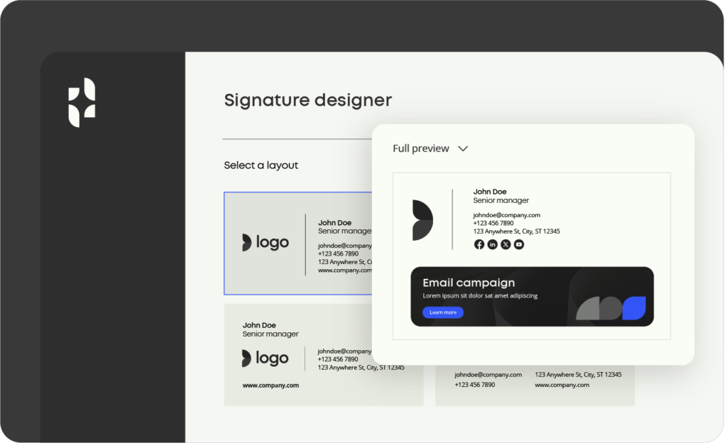
What it does best:
- Keeps branding consistent: Signatures are centrally designed and managed in Templafy’s admin platform, ensuring every email reflects the latest logos, fonts, colors, and company-wide brand guidelines. Updates happen instantly, eliminating the need for employees to adjust their signatures manually.
- Automates compliance: Legal disclaimers and industry-specific notices are applied automatically based on recipient type, region, or department, reducing the risk of outdated policies or missing regulatory details. This ensures every email meets compliance requirements.
- Personalizes at scale: Employee details like job titles, phone numbers, and office locations are automatically updated from Active Directory or HR systems, ensuring every signature is accurate, regardless of role or contact detail changes.
- Turns emails into a marketing channel:
Add, schedule, and update campaign banners and promotional links centrally. This lets marketing teams promote new products, events, or thought leadership seamlessly—no IT involvement needed. - Works everywhere: Whether emails are sent from desktop, mobile, Outlook, or Google Workspace, Templafy ensures signatures appear correctly formatted across all devices and platforms.
“All employees have access to updated and correct templates. We know that all approved pictures are easily available and that we are able to ensure that all disclaimers and general terms and information are updated on a regular basis.”

Ove Forseth
Brand Manager, BDO Norway
E-signature management is just the beginning
Templafy’s email signature management ensures every email sent is on-brand, compliant, and optimized for impact—but that’s just one piece of the puzzle.
Templafy is the AI-powered document generation platform that enables professionals to create accurate, compliant, and on-brand documents—fast. It works seamlessly inside the tools your teams know and love, like Microsoft Office, Google Workspace, and Salesforce, it automates workflows, so users never have to switch apps.
Trusted by KPMG, BDO, and over 4 million users worldwide, Templafy saves teams 30% of the time they’d typically spend on repetitive tasks—so they can get back to work that drives revenue.
Want to see it in action? Whether you’re interested in our email signature management or want to explore the rest of our document generation solutions, we’ll tailor a customized demo to your needs.
Additional content
More tools for creating great email signatures
Here’s what else you need to know about centralizing email signature management and distribution.
