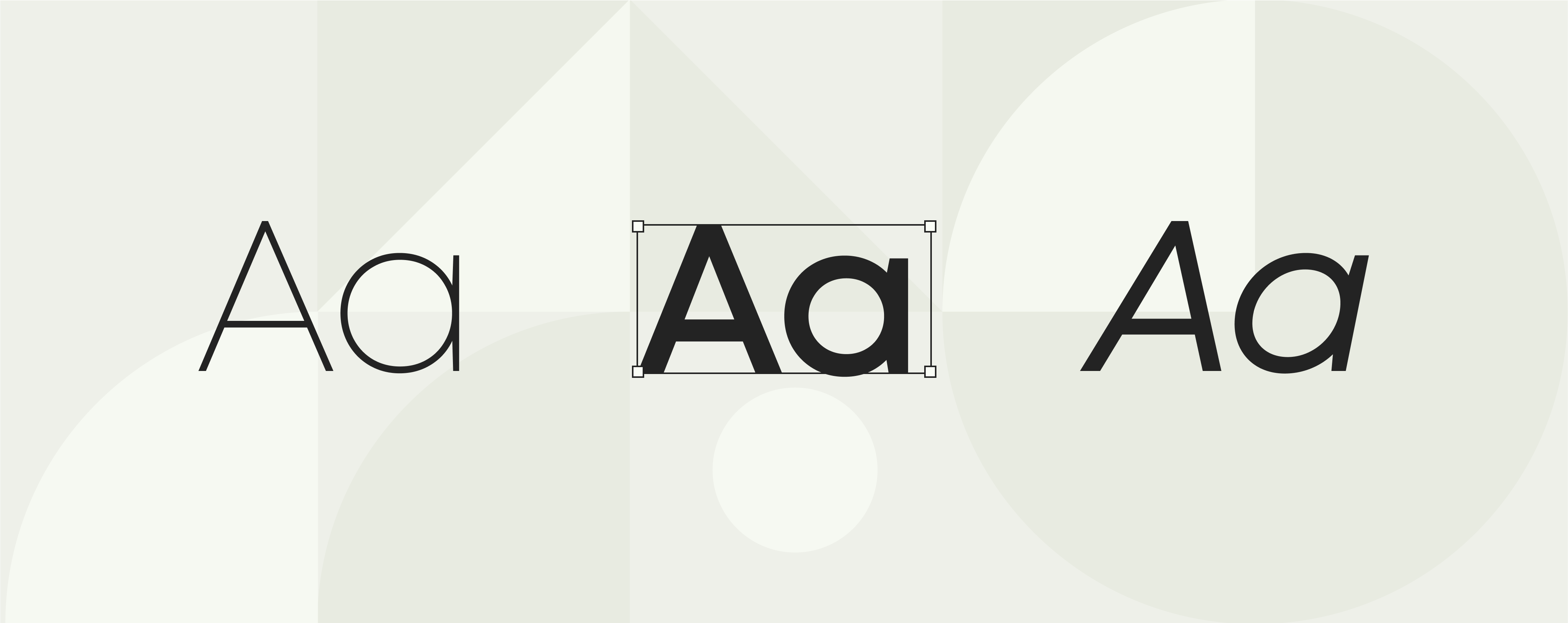
5 data-driven tips for choosing (or designing) the right corporate font

If you’re a brand, marketing, or design professional, chances are you could instinctively choose a corporate font that looks good and fits the job.
Some things just make sense: you probably shouldn’t use a handwritten typeface for a whitepaper or slap a generic Google font on a logo.
But corporate fonts need to be so much more than a pretty (type)face. They need to be accessible, load quickly across platforms, and work in multiple languages and contexts.
And then there’s the challenge of consistency. Your font needs to appear everywhere—from your website to marketing collateral to internal documents—and that requires the right tools and strategies.
There’s a lot to consider. That’s why we’ve boiled it all down into these five data-rich tips that will turn your corporate font into a strategic tool that boosts brand recognition and, ultimately, your bottom line.
Why corporate fonts matter so much
Most brand communications happen through words. That’s why a company’s corporate font should be seen as a strategic asset that, when used right, can help achieve broader business goals like building trust, fostering brand loyalty, and standing out in the market. In fact, one study found that consistent use of a specific font can increase brand recognition by up to 80% (Linearity), and another revealed that 75% of consumers associate fonts with specific companies or products (Design Buddy), showing the potential of corporate fonts to increase brand recall.
Building brand consistency (for example, by consistently using a recognizable typeface) is crucial because it builds trust and brand equity—and that directly affects revenue. In fact, 82% of investors say brand strength and trust influence their investment decisions (London School of International Business, U.K.), and brands that achieve brand consistency see an average revenue increase of 23% (Marq).
An example:
Just think of the font used by Coca-Cola. Its iconic typeface, an adaptation of Spencerian script, would be recognizable even without the brand name. It’s a perfect example of how a font can make a brand’s identity instantly recognizable around the world.
Here’s why corporate fonts matter, backed by stats:
- Brand recognition: Consistent use of a signature font can increase brand recognition by up to 80%. (Linearity)
- Trustworthiness: 72% of consumers make trust-related judgments about a brand based on its visual design. (Adobe)
- Brand association: 75% of consumers say they associate fonts with specific companies or products. (Design Buddy)
- Revenue impact: Consistent branding, including typography, can increase revenue by up to 23%. (Marq)
Let’s jump into five key criteria to consider to make sure your corporate font delivers.
corporate fonts
Five key criteria for corporate fonts
- Be inclusive with accessibility in mind
- Think fast: Make it responsive
- Choose fonts that can go global
- When to choose bespoke fonts
- Keep it consistent with document automation
Can’t-miss branding tips
Learn how to keep your brand consistent. Get ideas and examples to help your team create on-brand work with less effort.
1. Be inclusive with accessibility in mind
Despite 69% of marketers saying that providing accessibility features is important to executing successful marketing campaigns (Capterra), a study by Website Setup found that only 30% of websites consider font accessibility for visually impaired users (Website Setup).
Typography isn’t just about style—it’s about making your content accessible to everyone. Approximately 15% of the global population lives with some form of disability (Halo Lab), and legible fonts are essential for ensuring inclusivity.
To ensure your typography is inclusive and accessible, keep these key principles in mind:
- Clear character shapes: Choose fonts with easily distinguishable letters and numerals. For example, ensure lowercase “l” doesn’t look like the number “1,” and “O” is distinct from “0.”
- Generous letter spacing: Adequate kerning and tracking prevent characters from appearing too close together, improving readability for all users, including those with dyslexia.
- High contrast: Ensure sufficient contrast between the text and its background. This makes content readable for users with low vision and adheres to Web Content Accessibility Guidelines (WCAG).
- Avoid overly decorative styles: Decorative and script fonts may look appealing but can hinder readability, especially at smaller sizes or for users with visual impairments. Stick to clean, simple typefaces for body text.
- Sufficient font size: Use a minimum font size of 16px for body text on digital platforms. Small fonts can strain readers’ eyes and reduce accessibility.
- Support for screen readers: Ensure your font renders well when text is converted into speech, as screen readers are essential tools for visually impaired users.
- Accessible italics and bold styles: Avoid fonts where italic or bold styles are hard to read or excessively stylized, as this can reduce clarity.
2. Think fast: Make it responsive
In a digital-first world, speed is everything. Research shows that you have just five seconds to make an impression on consumers (Portent), and the first few seconds of page load time have the biggest impact on conversion rates. Don’t waste four of those precious seconds waiting for an unresponsive font to load.
Websites that take longer than three seconds to load lose 40% of visitors (Google), and fonts plays a crucial role in this equation. Heavy or unoptimized fonts can bog down your site, which leads to higher bounce rates, a poor user experience, and a big drop in search engine rankings.
To make sure your fonts don’t slow you down, opt for typefaces specifically designed for the web, such as Google’s Roboto or Open Sans. Combining these fonts with a reliable content delivery network (CDN) can further enhance performance and ensure fast load times globally.
Tips to optimize font performance:
- Choose web-optimized fonts: Select fonts designed for digital use, such as Roboto, Open Sans, or Montserrat, which are lightweight and load efficiently.
- Subset your fonts: Remove unnecessary characters and glyphs from your font files to reduce their size, especially if you don’t need support for multiple languages or symbols.
- Compress font files: Use tools like Font Squirrel or Google Fonts to compress font files into formats like WOFF or WOFF2, which are optimized for web use.
- Use a CDN: Host your fonts on a content delivery network to ensure they load quickly, regardless of where your users are located.
- Set fallback fonts: Always include a fallback font in your CSS (e.g., Arial or Helvetica) to maintain functionality and appearance in case a custom font fails to load.
- Limit the number of fonts: Stick to two or three font families on your site to minimize loading time while maintaining a clean and cohesive design.
- Preload critical fonts: Use the <link rel=”preload”> tag in your HTML to prioritize loading key fonts required for above-the-fold content.
Choosing and distributing fonts
Font choice and management is a vital part of branding. At Templafy, we help organizations manage their font lifecycle every day and we’ve compiled our learnings in this guide.
3. Choose fonts that can go global
If your brand works internationally, your corporate font needs to easily adapt to different languages and scripts. Fonts like Arial and Noto Sans support a wide range of scripts, ensuring your content looks consistent, no matter the language.
This adaptability is crucial because 71% of global consumers expect brands to deliver content in their native language (Unbabel). A font that works across languages ensures visual consistency, as well as communicating cultural sensitivity and professionalism.
Tips for choosing global fonts:
- Maintain aesthetic harmony: Select a font that keeps its design integrity across different languages and scripts.
- Check script coverage: Ensure your font supports non-Latin alphabets, such as Cyrillic, Greek, or Devanagari.
- Plan for future expansion: Consider whether the font can accommodate additional languages as your brand grows.
- Test in-context: Preview your font in real-world scenarios, such as multilingual websites, to ensure cohesive branding.
4. When to choose bespoke fonts
If you want to really make sure your visual identity is unmistakable, a bespoke (or custom) font is the right way to go. Bespoke fonts give your brand team the chance to perfectly reflect your company’s personality, values, and mission. And they make it harder for competitors to replicate your visual identity.
Why bespoke is better:
- Brand exclusivity: A custom font is unique to your brand, so no other company can use it.
- Stronger recognition: Custom fonts like Google Sans and Netflix Sans enhance brand recall and recognition by creating a consistent and memorable visual identity.
- Cost efficiency: Bespoke fonts eliminate ongoing licensing fees, offering long-term savings. Brands like Netflix and Airbnb have adopted custom fonts to reduce costs while maintaining a cohesive global presence.
- Optimized performance: Tailored fonts are designed to work seamlessly across all mediums, from digital to print, ensuring exceptional versatility.
Consider bespoke fonts if:
- You want a completely unique brand identity.
- Your brand spans multiple languages and needs a typeface tailored for multilingual support.
- Long-term cost savings outweigh the initial investment in font design.
5. Keep it consistent with document automation
Your font can only deliver its full impact if it’s applied consistently across every touchpoint. Inconsistencies—like using the wrong font weight or substituting an off-brand typeface—can erode trust, dilute your brand identity, and confuse your audience.
That’s where tools like Templafy come in. Templafy’s document automation platform ensures your corporate fonts are automatically applied to every document, using pre-approved templates. Whether it’s a PowerPoint presentation, Word document, or Outlook email, Templafy keeps all elements of your typography on-brand, no matter who’s creating it, or where they are.
How Templafy keeps your corporate font consistent:
- Automated font application: Fonts are applied correctly to all documents, eliminating manual errors.
- Integration with tools: Templafy works from inside the most popular content tools that your teams are already using, like Microsoft Office and Google Workspace, so there’s no excuse for using the wrong typeface, font size, or colours.
- Centralized control: Everything is controlled and managed centrally, so teams across departments and locations always use the correct fonts and styles.
- Global accessibility: Templafy integrates with CDNs to deliver fonts efficiently across geographies.
Ready to take your brand consistency to the next level?
Choosing the right corporate font is just the start—ensuring consistency across your entire organization is how the type becomes your face. Discover how Templafy automates the important parts of document creation, so your teams can create on-brand, professional, and compliant, in just a few clicks.
Want to learn more? Book a demo to see Templafy in action.


